

SKT T1 skins for Season 6 leave behind the contemporary, modern interpretations used before for a different, fantasy style that fits the realms of League of Legends better. There’s a subtle Greek influence, notorious golden armour and a few touches of red. There’s also the insistent T1 logo regardless of suitability so some skins manage the reference better than others. Still, do the skins manage to realise new identities for the champions? Only one way to find out: let’s check on the skins.
Splash Art
There’s no real background or setting to speak of. At best, we could say that the champions are framed by a sky of undefined characteristics. What stands out is the setup of the piece. The ensemble appears like a group of superheroes in a composition that brings to mind the Justice League. Their general appearance seems to convey a pantheon of Greek gods, each with their unique symbolism. There’s also a suited coach that stands in for the ward skin. While it’s good that such an addition is made part of the team it’s fair to say that his look doesn’t fit that of the heroes well.
Each champion shares the spotlight making use of uneven parts of the splash art. Champions on the left tend to be able to make use of more space while those on the right see their lower bodies abruptly cut off. There’s empty room on the left which means that everyone could’ve made some extra room by advancing a bit forward. In addition to this, it’s clear that the centre of the piece has sharper lines and more vibrant colours; though tones tends to be subdued to the point that all metal seems dull. The blur is particularly noticeable towards the left and bottom areas which does the portrayals no favours.
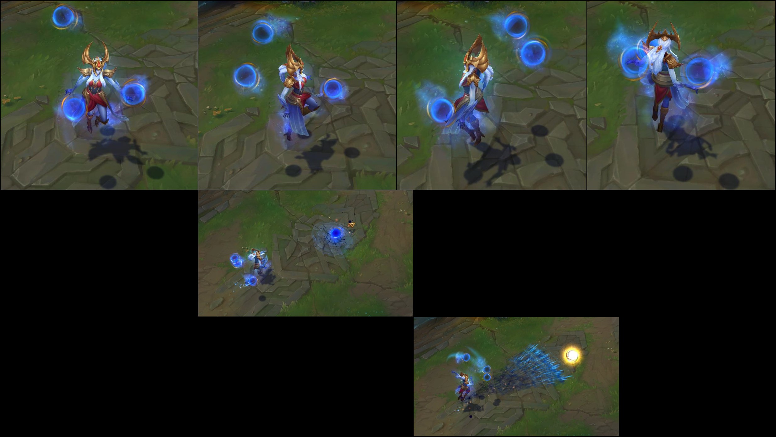
The ornamented armour characteristic of each champion in their SKT gear is noticeable but with varying degrees of success. Individually, Zac looks too subdued and solid with little attention given to his armour; which is the only characteristic that sets him apart from Classic besides the new colour. Jhin’s upper body is quite explicit but the rest is barely visible and the depiction seems rather pedestrian. Nami barely emerges from the blur and shows too much of her naked back and too little of her armour so that it’s more notorious her familiar mermaid body than the new gear. Syndra almost appears in full with nice shading and a good demonstration of power; despite small spheres and dull colours. Ekko is only partially visible and while the new look is prominent enough that’s because of the clothes more than the portrayal effort to make him special, even if the pose is dashing and dynamic. Finally, Olaf closes the formation with good use of light and shade but a partial depiction with much blur and opaque colours that is only saved by the suitable stance. Not to be forgotten, KkOma looks sketchy with a cartoony look that doesn’t suit the more elaborate shading used for the champions; much as his suit doesn’t fit the classical style of the champions.
All added together, this is a splash art that makes a brief but impactful presentation of the champions thanks to its composition. The individual portrayals are marred by several issues so that each champion struggles to attract attention and even convey their actual look. For all that the piece does well in its setup there is an evident need for a good layer of polish to finish the potential of this splash art.
 |
 |
| Category: | Legacy |
| Price: | 1350 RP |
| Concept: | Ekko wearing golden armour. |
| Model: | New model for Ekko and his sword plus new glow for his sword. |
| Particles: | New particles for his abilities, auto-attack and recall. |
| Animations: | New recall animation. |
| Sounds: | New metallic sounds for his auto-attack, abilities and recall. |
| Rating: |  |
| Conclusion: | While technically SKT T1 Ekko does offer new clothes for him in general terms the style is all Ekko. There’s no punk motif and the clothes are more elaborate, richer, perhaps even more aristocratic but particularly complex without good reason; there’s only a faint Greek aesthetic at play. Something supported by the new golden boots, gloves and headpiece; which match the golden lined clothes. Regardless, he still looks like a boy dressed in fancy clothes; more whimsical maybe. The new Z-Drive looks like an empty sand clock and the sword is designed as a ceremonial item. Particles have more than some resemblance with Sandstorm Ekko. In fact, the colour is very similar and only the glow of the sword actually stands apart as well as some red in some initial parts of abilities. Z-Drive Resonance has an interesting indicator of concentric circles which is also used by Timewinder along an interesting red core. That design of curved parallel lines is also briefly used for Parallel Convergence as well as sword trails in the auto-attack; though they are rather brief and small. What stands out is the letters that quickly change under enemies after Parallel Convergence slows them. The parallel rings that indicate Phase Drive’s improved auto-attack are also interesting and that’s as far as things go. The rest of the abilities are essentially re-coloured. Chronobreak makes two exceptions: the SKT T1 letters over the hologram and the T1 logo when Ekko blinks to the hologram. While the former addition is an interesting touch despite the unimpressive message, to the point that it could’ve been used in PROJECT: Ekko, the latter is mere promotional material. For sounds we have a dull metal clank for the auto-attacks that gets higher in pitch for the third strike of Z-Drive Resonance; much like a high-pitch version of the classic third strike. Timewinder vibrates like thin metal being scratched and Parallel Convergence starts with high-pitched tinkles that result in a powerful and deep metal clank. Phase Drive has a distinct and brief initial vibration that changes to a quasi-comical, loud vibration sound when Ekko strikes the enemy. The sound is quite appealing and seems rather suitable for PROJECT. Chronobreak, strangely, has a simple but distinct sound: that of a large but high-pitched bell ring that suits the fast teleportation very well. The new recall has its appeal. The joint appearance of holograms and interaction with them is an interesting display of time displacement. Actually, it’s a good use of Ekko’s identity for a send-off. All added together, there’s too much retreaded ground. The new model is different and even complex but convoluted without a proper message to tell. Particles are uneven as some are simply re-coloured and very similar to Sandstorm while others have an interesting design that isn’t expanded upon while sounds are straightforward. Thus, this is a skin that leaves too much room left unexploited, unchanged and worse: ignored. There’s some appeal but buried within the conventional. |
 |
 |
| Category: | Legacy |
| Price: | 1350 RP |
| Concept: | Jhin as a vintage, enhanced gunslinger. |
| Model: | New model for Jhin and his gun. |
| Particles: | New particles for his abilities, auto-attack, laugh and recall. |
| Animations: | New recall animation. |
| Sounds: | New music for Curtain Call and new recall sounds. |
| Rating: | |
| Conclusion: | In terms of looks, SKT T1 Jhin furthers the classic style technological artistry by accentuating both aspects but with a base of old style. In other words, Jhin employs elegant, gold-lined clothes with golden armour and weapons with distinct feather decorations. The design is rather practical and fine tuned to make good use of the enhancements that make Jhin a unique gunslinger. At times he may look derivative and other times like a vintage cyborg; depends on the occasion. Particles are nothing extraordinary truth be told. Auto-attacks are essentially re-coloured gold with few, scant touches of red. Even enemies marked by Caught Out have an indicator that is almost identical to the classic one. The Lotus Trap used by Captive Audience does stand out. It has a design that is quite ornamental with a classy base of gold with a red gem at the centre; a suitable and elegant choice. Curtain Call doesn’t show an ample shoulder transformation as Classic and the technology seems to be more inclined towards form rather than function. That is further supported by the distinct translucent wings that appear on Jhin’s back. Overall, the ultimate manages to display the unique identity of the skin. T1 logos can be briefly seen when marked enemies with Caught Out are damaged and at the beginning of Curtain Call. As a small reference it works but doesn’t seem like it naturally fits the skin. Theoretically, Dancing Grenade is to have a new sound but everything seems identical to classic as in the other abilities. Curtain Call, though, is another story. The ultimate received a new violin-based theme that stands apart from classic while keeping his artistic persona; something that suits the skin’s vintage style well. The recall with its electronic music and square lights seems modern yet not contemporary. Added to the antique design of Jhin it gives a fitting retro feel to the skin’s personality. Sadly, it’s the only feature to display such aspect suggested by the model. On the whole, SKT T1 Jhin is a fine skin. The model is quite interesting but the particles let down with few notable work outside of the colour department and sounds are meagre to say the least. The ultimate and recall add to the skin’s identity better than the abilities. Still, there’s a clear feeling that much is merely adapted instead of newly developed to support the potential of the new identity. While there’re features to like, the whole of the skin needs more work. |
 |
 |
| Category: | Legacy |
| Price: | 1350 RP |
| Concept: | Nami dressed in blue and gold. |
| Model: | New model for Nami and her staff plus pale blue water below her. |
| Particles: | New fishes for her taunt plus new particles for her abilities, auto-attack, laugh and recall. |
| Animations: | New recall animation. |
| Sounds: | New sounds for her abilities and recall. |
| Rating: | |
| Conclusion: | With soft blue scales and skin, red hair of thick strands and golden armour and tiara SKT T1 Nami has a regal look that suits her well and stands out with bright tones. The staff also displays copious amount of gold just as the water below her has a gentle, pale blue. The hair can look too solid but her decorative armour is rather nice; even showing a ring around her tail. It’s all purely cosmetic as it doesn’t seem like effective protection but the Tidecaller is no frontline warrior anyway. Her abilities show a distinct gold tone that makes the water look purely magical. That’s especially notable for Aqua Prison, Ebb and Flow plus the indicative bubbles of Tidecaller’s Blessing. Auto-attacks are a glowing tipped stream of water, which breaks the style a bit, and get added gold with Tidecaller’s Blessing. The same can be said about Tidal Wave. Said wave is purely water with many golden sparks; like in her laugh. The apparition of the wing logo, echoing the shape of her staff head, is a subtle and classy addition that makes the ultimate feel special despite the strong reliance on the classic style. The explicit SKT T1 logo where an Aqua Prison lands isn’t as elegant, though. New sounds are added on top of the classic ones but the result isn’t bad. Aqua Prison has a the added vibrations of metal against metal as in a rustic musical instrument. Ebb and Flow adds a bright metal tinkle that suits the golden sparks well. Tidecaller’s Blessing has a similar but lower-pitched sound to Aqua Prison while the improved auto-attacks add a clank of metal. For an ultimate, Tidal Wave doesn’t impress but is interesting: the wave hits enemies with a deep bubbling sound that speaks of power but restrained; which could suit other skin themes. Her new recall is a series of jokes at her expense. With several selfies for her mix of sushi and nyotaimori she’s finally picked up whole for her transportation; at least she’s safe at the end. While it surely is something unique and rather funny, the first few times, it adds nothing to the personality of the skin. All in all, this is quite a nice skin with fine additions that keep the classic personality intact but serve as an appealing change of look. Still, there’s nothing here that explains the high price. In this price tier much more is possible as cheaper skins have made just as much; the hint of something special by the legacy label is wholly lost. Therefore, this is an appealing skin but one that leaves one wondering why so little was done when there’s room for much more. |
 |
 |
| Category: | Legacy |
| Price: | 1350 RP |
| Concept: | Olaf as a red-haired, regal axe-warrior. |
| Model: | New model for Olaf and his axes. |
| Particles: | New particles for his abilities and recall. |
| Animations: | New recall animation. |
| Sounds: | New sounds for his abilities, auto-attacks and recall. |
| Rating: | |
| Conclusion: | While SKT T1 Olaf doesn’t depart far from the classic fantasy it does have a distinct style. The heavy, dark, gold-lined armour stands out with its eye-catching contrast of colours; supported by the red mane of hair and beard. In essence, it’s the Berserker with a more royal look that draws from classic high fantasy. It may not be original but it’s appealing. The axe’s faintly approximate the wings of the T1 logo which is a subtle and effective reference. Particles all share a new golden look that stands apart from the classic ones. The general design is very similar to the classic ones but the new colours help make the abilities feel different. In most cases it’s the same design but the new colour and sometimes patterns make them different. For example, Undertow’s axe hits in a shower of sparks. Axe’s on the ground are signalled by the wing logo which works as a reference to the axe’s blades as well. Vicious Strikes shows some subtle gold sparks. However, the new semi-transparent lightning for Reckless Swing is quite eye-catching. The same can be said about Ragnarok’s golden glow which clearly displays the might of Olaf in a more explicit, magical way. The T1 logo in its beginning doesn’t work that well as it seems detached from the feasible design used elsewhere. In terms of sounds, auto-attacks and Undertow have a high-pitched metal sound that fits the fine golden decoration of the axes. Vicious Striker goes with a straightforward low-pitched howl but Reckless Swing has a fantastic addition: thunder strikes with the lightning and then echoes as if dissipating into the distance; a great touch for any Olaf skin. Ragnarok employs an unimpressive but reasonable metallic vibration, like a large but quiet bell, that could’ve made more of an impact considering we are talking about an ultimate. The recall is simply a reference at gaming with bad temper. It may also have extra meaning beyond the obvious but with regards to the skin, it doesn’t add anything to its identity. All things considered, the model is quite good and some of the particles and sounds stand out. However, the classic core is untouched and only decorated with a clearer fantasy style. Too little’s done to fully realise a new identity for Olaf even if that is as a magical berserker: it’s only partially developed. As such, this is a skin with some good features but doesn’t add up to an impressive whole. |
 |
 |
| Category: | Legacy |
| Price: | 1350 RP |
| Concept: | Syndra dressed in blue and gold. |
| Model: | New model Syndra and new Dark Spheres. |
| Particles: | New particles for her abilities, auto-attack and recall. |
| Animations: | New recall animation. |
| Sounds: | New crystal sounds for her abilities, auto-attacks and recall. |
| Rating: | |
| Conclusion: | The appearance of SKT T1 Syndra isn’t far from an alternative look for her. It follows her classic pattern of elaborate headgear and a decorated dress with a bit of armour. The design is elegant and the colours soft and dark except for the gold. The blue skin seems to come out of nowhere even if it makes for a nice match for her Dark Spheres. Their shape is more irregular which makes them more interesting and the soft blue with golden decoration echoes Syndra’s aspect rather well. Particles mostly follow up the classic template respecting the new colour palette. Explosions, links, waves and beams become light blue with tips of gold for the respective abilities and auto-attacks. With the Transcendent bonus each ability displays more gold. Additionally, Dark Spheres leaves a clear ‘T1’ print on the ground when they are summoned or thrown, right above the cracks, which feels like a bit too much self-promotion. New sounds add a crystal chime to the abilities and auto-attacks. It’s more noticeable in the auto-attacks, Dark Sphere and Unleadhed Power while the other abilities have a duller, lower pitched sound that isn’t as appealing. The classic sounds seem to remain but with the added crystal sound which sometimes works well as in Dark Sphere and sometimes it gets lost amidst the classic sound as in Force of Will and Scatter the Weak. The recall takes advantage of Syndra’s distinct magic to present a trophy over the signature of the respective player. It makes for a good show that suits her though not to the point that it supports her unique identity. All added together, this is a skin that does just enough to show changes even if she does look nice. There’s a new model for Syndra, her Dark Spheres and new colours along crystal chimes for her abilities plus a new recall. Yet, truth be told, it feels like too little for the price tier the skin belongs too; add to it that it’s a legacy skin and the special feel isn’t really there. Considering the prominent use of the T1 logo there’s a perception that the skin is more promotional material than sold product, in which case it shouldn’t be paid; at least, not priced so highly. It’s a good skin, it suits Syndra and looks nice but there’re many better and more interesting alternatives for the Dark Sovereign. |
 |
 |
| Category: | Legacy |
| Price: | 1350 RP |
| Concept: | Zac wearing light, golden armour and sporing a white ponytail. |
| Model: | Moderate model changes for Zac and minor model changes for Cell Division’s bloblets. |
| Particles: | New particles for his abilities, death and recall. |
| Animations: | New recall animation. |
| Sounds: | New metallic sounds for Stretching Strikes, Unstable Matter, Elastic Slingshot and recall. |
| Rating: | |
| Conclusion: | One of the first questions that arises when looking at SKT T1 Zac could be: which flavour? The answer may lie between cherry and strawberry. Because the new red colour is the most significant modification to Zac this skin starts by feeling close to a chroma. The addition of inexplicably flexible golden armour and a ridiculous white ponytail aims at adding more to his style. They add something but not by integrating into a design that realises a new identity for Zac. It’s the same jelly-boy but with some bits of armour and a wig. The bloblets used for Cell Division match his look which is a good even if potentially necessary touch. Particles fail at being more than a consistency pass. The abilities merely receive red-coloured splashes of goo and that’s as far as it all goes. One exception worth noting is the decorative indicator of Stretching Strikes. The golden curved lines match the design of his armour and suggest a motif that is never developed in the skin. There’s also the unavoidable T1 logo for Elastic Slingshot which doesn’t contribute to the skin’s identity in any way. For all intents and purposes, abilities retain their classic look but re-coloured sans one worthy exception. Sounds for abilities and auto-attacks, sans ultimate, have an added metallic clank that is brief but notorious for the most part. The exception is Unstable Matter which instead of a clank has a metal scratch added. While none of the sounds are remarkable they add style and make the metal armour more revelant and prominent. The recall is a good play on Zac’s identity. One could wonder if it’s healthy for him to eat so much jelly. Of course, the question of which flavour he is easily springs to mind, again. At any rate, he better not eat too much or he may end up being full of himself. In few words, it’s a clever take on Zac that brings forth many funny derivations while remaining relevant to his playful personality. In the end, SKT T1 Zac is an uneven and even underdeveloped skin. There are hints at an identity and a couple of good touches added to the skin. Regardless, at large, the skin struggles to be more than a change of colour. Considering the expectations that arise from the price tier it’s worth asking if a chroma wouldn’t be a better option. |
Conclusion
For all the expectations that the 1350 RP price tier provides the skins aren’t satisfactory. New identities are often hinted but seldom developed. Much is left adapted or simply untouched from the classic personas with few significant features that accomplish a well rounded theme and execution. That’s not to say that there’s nothing to like but it’s difficult to justify the expense, also with legacy restrictions to sales, when the skins end up not offering enough to wholly round their proposed concepts. In general, these champions have better and cheaper skins at their disposal. One by one, in summary this is how they end up.
SKT T1 Ekko is a skin with little meaning in its model and only a few interesting particle designs; most is practically borrowed from Sandstorm Ekko. There’s simply too much unexploited potential and the shared style does no favours in defining an identity. Even if there are a few additions that stand out the overall feel is of a subpar skin that might even be considered unfinished.
SKT T1 Jhin is a skin with a very fine model and some good touches to the ultimate and recall. The rest, unfortunately, lets down with adaptations of the classic designs instead of further work to develop the personality of the skin. With that in mind, there are things to like in the skin. However, there’s a lot that is left unexploited so that the skin’s identity isn’t effectively rounded in all areas.
SKT T1 Nami is an appealing skin that doesn’t change her identity but makes for a fine change of appearance. Model and particles are quite pleasing but, preposterous recall aside, there’s nothing else. It’s a good option but there’s ample unexploited room left untouched. At this price tier much more can be done and the Tidecaller has other skins that support very well that assertion; if in doubt they can be a better choice.
SKT T1 Olaf keeps the core of the berserker but in high fantasy style. The new gold-lined armour is rather interesting and works well with the red hair. Particles mostly respect the classic template but with the new colour and some new patterns they stand out rather well. Overall, it’s a good skin with the initial steps of a fantasy identity for Olaf that is never fully developed. For that reason, the skin has potential but uses too much of the classic persona.
SKT T1 Syndra is a skin with suitable and appealing changes. The new model for Syndra and her Dark Sphere is good and the new look of her abilities fit well; even the recall does. It still feels like too little change for a clearly promotional product. At its price tier, more is expected; especially considering the ample selection of interesting and cheaper skins at the Dark Sovereign’s disposal.
SKT T1 Zac is a skin with few interesting features. The most salient characteristic is, evidently, the new colour. The armour and hair add a bit but little to make his appearance distinct. With only a novel indicator for one single ability and a recall to stand out this is a skin that barely offers more than a chroma. There’re a few things to like but so few that it’s questionable how it can be priced so high when it offers so little.
Wow! these reviews are more harsh than i expected
We apologise but comparing the SKT T1 skins to others that each champion has and what can be done at the 1350 RP tier we simply can’t be generous. The skins have potential and there are things to like but there’s a noticeable need for extra depth and development.
Hi Zero ! Would like to know your answer if asked for comparisons between the three seasons of SKT’s skins. Thanks for replying
Initially, back in the old days, tournament skins were a novelty to celebrate the championship. The price was low, 750 RP, and the skins were alright for their intent. They were never intended to compete with the other mainstream skins of each champion. They were a commemorative token that could have some extras and be interesting or simply be a token.
That roughly went like that until the SKT T1 Season 3 skins. By season 4, Samsung White skins, a few 975 RP skins appeared. Like SKT T1 S5 skins, they were more expensive and elaborate though they seldom amounted to something remarkable; Kalista’s skin being an exception. Now in season 6, we find that the commemorative tokens have lost touch with reality. They are not more elaborate than past skins yet the price is higher.
Sure, the SKT T1 S6 skins are more interesting with their faint Greek style than the casual look used elsewhere; in general terms, at least they feel novel now. However, there nothing really special about the skins except for the overblown recalls. The rest of the skins isn’t bad but also isn’t impressive either. If we are talking about 1350 RP and as legacy skins then we could suspect that something that stands apart from the norm is to be offered. That hardly is the case in season 6.
In conclusion, SKT T1 S3 skins are a cheap token for fans. S5 skins are more for dedicated followers of the tournament scene. S6 skins are for the real fanatics. Any of these champions has better and more interesting skins at their disposal and often for much less; in base price and also on sale, as legacy skins can’t go on sale. We don’t see a real reason to prefer the SKT T1 skins in most cases. Olaf can be an exception due to his neglected wardbrobe and still is something questionable. All around, these skins seem like an expensive demonstration of fanatism that, ultimately, don’t add up much to the skin realm.
Do you have ratings for Ward Skins? What do you think is the best ward skin? The kKOma ward?
No, unfortunately. Truth be told, we see little worth in ward skins. There’s a starting, idle and ending animation for them and that’s it. Usually, there isn’t much that stands out; though some are nice like the recent Dawnbringer one, if we recall correctly. Besides, as you would, ideally, not be staring at a ward and instead leave it to concentrate on something else they seem like a luxury item.
If you often use wards and like the KkOma ward then you can consider buying it. We’d rather spend the money on a champion skin on whom you will be staring for a good while. Depends on the use and worth you see on ward skins. We just aren’t convinced by them but that’s just our view.
The only reason you’d buy these skins is to show your love to SKT T1.
For the most part, that would be an accurate assessment.
Hey, I’ve found you’re blog and it really fascinated me. A site with every information about skins, from particle changes to prices. What impressed me the most, however, were the skin reviews. It’s such a deep analysis, with so much effort put into them, reviewing even the most tiny details! But, there was a reason why I didn’t liked them and didn’t took them in consideration. Yes, they impressed me, but also disapointed me. More specifically, the ratings. The fact that the skin’s price affects the rating so much, really buggs me. I think the skin should be evalueted for itself and the price should not be taken in consideration. According to your ratings, Assassin Master Yi is better than Dark Star Tresh. I get why this is like this, but I don’t agree with it. I give you all the congratulations in the world for the reviews, but I won’t be coming to this site very often.
Glad that tyou appreciate the effort; though a pity you don’t find the reviews useful.
We understand your point. The way we see it, each price tier has a set of features that they can use to realise their concept as explained in the Guide to Skin Tiers. We consider that if a skin does a lot within its limitations then its good. Of course, more expensive skins have more resources available so with a good implementation they can easily be better.
A way of looking at the tiers is that skins within the same tier are comparable but across tiers the differences do make them difficult to compare. We still try to compare across tiers to recommend skins for each champion; in which cases most expensive skins usually have the upper hand. Without price in the equation the most elaborate skins are usually better. In fact, ultimates and legendaries always offer more; though they don’t always make the most of the label they carry.
In the case you mention, without a price, Dark Star Thresh’s superiority over Assassin Master Yi is trivial. What isn’t always obvious is that Dark Star Thresh does have problems in comparison with what a legendary can do. Also, that Assassin Master Yi, as far as re-models go, is quite well done.
The problem is that prices are an obstace to getting a skin and one that won’t disappear. Therefore, we think that you should get the most out of each skin tier. For that, it’s necessary to evaluate what each skin does with the resources they have available. This means that price can’t be ignored.
We agree, comparing skins across tiers does leave some funny conclusions. However, we thought it was the best way of evaluating the value of a skin. If you have any suggestion about how we can improve the reviews we’d appreciate them.