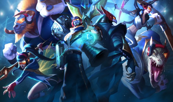
SKT T1 is not only the season 5 champion but also the first team to win two world tournaments. Against fierce competition they reclaimed their title and took hold of another trophy. Such an achievement deserves a set of skins to commemorate it; not just any skins. This set offers several extras to make each skin quite special but, are they? Delve further into this skin review to find out.
Splash Art
In terms of background, we can guess that the few flashes and lights around the champions intend to reflect an arena where they have proved their skill and ended triumphant. That’s all guesswork because there’s nothing concrete to reveal it. Although there’s little room for a setting, what is available is mostly filled with empty colours.
The rest is the shared display of the six champions. Colours are saturated but the excellent use of lighting allows for a contrast that makes the depiction full of detail, in places. There are simple surfaces, especially on the outskirts of the piece so it’s the champions on the centre that tend to receive the best work. It’s enough to compare how much of each champion is displayed and occluded to find the areas in-between where details are lacking.
Kalista manages to insinuate herself quite clearly while enjoying some great use of light. The highlights on the golden speak and the transparent ones on her back also catch the eye; better than the sketchy jacket. Alistar appears a bit simple in the large surface of his body but the head is sharply depicted. Metal and hair are nicely shown but cloth disappoints. Ryze stands in centre stage and is the only one whom more than posing is also displaying his magical might. Still, his face can seem cartoony and his legs foggy. Much more pronounced is that effect on Azir. In spite of the daring pose his back is mostly and empty shadow so there isn’t much to see. Only his outline and most salient features are noticeable. Elise seems to be web-slinging into action but the intense lights dull the colours of her body. Still, the evident contrasts manage to make her face clear. Renekton is the one whom struggles the most to catch a share of space. His face looks good though it’s not as vibrant as other areas of the piece. His body, is submerged in a blur that conceals what isn’t visible but also what is; like his arms. The blade is surprisingly hidden in darkness, which may make some sense, but is a letdown.
Overall, this is a splash art that provides an uneven distribution of space for the champions. Large ones struggle in small areas while smaller ones receive full depictions. It’s not just that, the portrayals themselves are also uneven with sharp areas against blurred ones. The composition isn’t bad at all. The daring and dynamic call to action is a classic choice that works well in any team. However, the result doesn’t take advantage of it and seldom organizes the champions in ways that make the most of their unique personalities. It shows that its an abbreviated display of champions and so the portrayal suffers for it.
 |
 |
| Category: | Legacy |
| Price: | 975 RP |
| Concept: | Alistar dressed in a flashy, contemporary way. |
| Model: | New model for Alistar. |
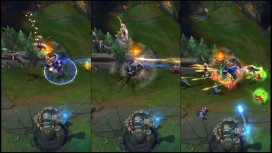
| Particles: | New particles for Headbutt, Unbreakable Will and recall. |
| Animations: | New recall animation. |
| Sounds: | New recall sounds. |
| Rating: |    |
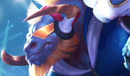
| Conclusion: | The glamorous colour selection and psychedelic hairstyle of SKT T1 Alistar easily stand out when taking a first glance at the skin. The style is certainly not ridiculous but has a certain vintage, space age feel that works better than the team endorsement side it can’t hide. The sunglasses coupled with headphones, large back logo under and equally large hood plus colourful gloves compete for attention. They also, define the modern, flashy fashion of the skin. Strangely, the trousers and snickers are rather reserved and the former look like simple, dark leggings. Horns become metallic and extend as part of the headphones which is unexpected as the minotaur features aren’t concealed or adapted to something more believable. At least the recall matches the feel by being just as whimsical. What is clear is that the modern fashion sense is mixed with a flashy style that resembles the excesses of disco. That does give the skin an identity of its own but struggles to work alongside the logos and ludicrous skin and hair colours. The team endorsement asks for compromises that restrict the potential space age feel of the skin which makes it feel too extravagant. The space age side is appealing but the STK design restricts it too much so that it ends up closer to an ad than a fashion statement. |
 |
 |
| Category: | Legacy |
| Price: | 975 RP |
| Concept: | Kalista wearing sporty clothing and wielding golden spears. |
| Model: | New model for Kalista and her spears. New yellow glow for Kalista and her spears. |
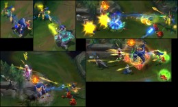
| Particles: | New blue and yellow particles for her abilities, auto-attack and recall. |
| Animations: | New recall animation. |
| Sounds: | New recall sounds. |
| Rating: |     |
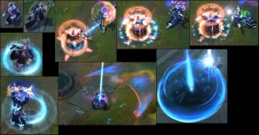
| Conclusion: | Never before had the Spear of Vengeance looked so human and even full of life. SKT T1 Kalista shows her alive and well despite a spear going through her body; the ones sticking from her back aren’t solid. Regardless, her lively ponytail, colourful jacket, leg-revealing shorts and colourful snickers are an eloquent presentation of a side of Kalista yet unexplored. The modern interpretation is effective and appealing. It only needs some help in explaining the spears in her body. The glowing ones could be decoration from the golden ornament on her back; which is a bit exaggerated. The Black Spear isn’t so easy to explain though its design matches the ones she wields. Overall, the young and alive Kalista is visible and is, at least, an echo of what she would look alive in the contemporary world. The recall full of energy and excitement reinforces this idea. The new particles also set the skin apart and further define its distinct look. Her spears glow in a transparent, golden glow with blue highlights. That makes her auto-attacks, Pierce and Rend, appear attractive and unique. The same applies to Oathsworn and Fate’s Call in their different displays of magic. Sentinel follows the style with more blue than yellow but manages to suit the general feel. All things considered, SKT T1 Kalista is a skin that accomplishes a novel, young-spirited style that stands apart from the usual spectre form. The human look and youthful displays, added to the golden spears define a unique feel for the skin. Fan of Kalista will find that SKT is more than a team advertisement. |
 |
 |
| Category: | Legacy |
| Price: | 975 RP |
| Concept: | Ryze dressed in a flashy, contemporary way while carrying a huge trophy. |
| Model: | New model for Ryze. |
| Particles: | New blue-yellow particles for his abilities, auto-attack and recall. |
| Animations: | New recall animation. |
| Sounds: | New recall sounds. |
| Rating: |    |
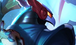
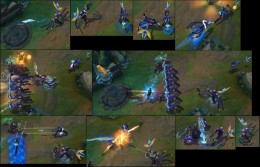
| Conclusion: | At a glance, Ryze seems to be a fanciful gamer with an ostentatious fashion sense. That’s before something ridiculous is spotted hanging from his back. If we are to assume that he has won a tournament then this could be the case of Ryze taking the trophy and running with it; literally. As preposterous as that seems nothing about the skin even tries to offset such absurdity. Sure, the trophy is quite detailed and believably modelled but makes little sense to carry such a weight like that. Especially for a gamer, a more sensible alternative could’ve been found. Moving on to the clothes, the trousers are unremarkable except for the baggy bottoms. The large tongues of the snickers connect with them in terms of size but, as the previous item, the trainers aren’t special. The jacket is quite colourful but reasonable as long as we forget the flamboyant front with golden trimmings and a large logo. The gloves are extravagant and make no sense except for a way to catch attention. The headphones are a bit large but reasonable enough and the sunglasses surprisingly stylish and practical; colour aside. The strip of cloth hanging from his waist seems completely out of place. The laptop does fit the theme but hanging it from the waist seems a bit too precarious for something so precious. At least the recall makes better use of it though it goes into unnecessary drama. The blue-yellow particles remind too much of the classic style but manage to add a bit of personality to the abilities. Thus, as a gamer, Ryze mostly fits the bill if it weren’t for the irrational trophy carrying. The clothes are rather flamboyant but for the most part deliver the intended message. It’s only that in the process of placating the classic design some unreasonable choices have been made that aren’t even interesting despite their lack of viability. Add the weak particle changes and SKT T1 Ryze can’t get past alright. |
 |
 |
| Category: | Legacy |
| Price: | 975 RP |
| Concept: | Azir wearing modern, casual clothing. |
| Model: | New model for Azir, his staff, Sand Warriors and Sun Disc. New glow for Sand Warrior spears. |
| Particles: | New particles for his abilities, auto-attack and recall. |
| Animations: | New recall animation. |
| Sounds: | New recall sounds. | Rating: |    |
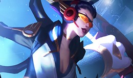
| Conclusion: | Wearing a colourful jacket, simple trousers, tabi as well as silver-golden vambraces and a helmet, which match the winged staff, we find the Emperor of the Sands. Add to that the straps attached to his arms and we find that SKT T1 Azir looks a bit all over the place. There’s a degree of casual clothing but also some armour with a sci-fi touch though never actually managing to be so. The appearance remains in the limit between the fantasy camp and the modern world. This leads the skin to look unfocused. The Sand Warriors further spread the dichotomy as they look like normal people out for a trek yet wielding silver spears and shields. That’s not to say that the look isn’t appealing but there’s little rhyme or reason to it. The Sun Disc, a clear homage to the SKT logo strikes as simple and defies all explanation. If the model seems unfocused then it’s no surprise that so are the new particles. They are a mix of blue and yellow that aim to follow the general colour scheme. However, said scheme relies more on dark tones and blue than yellow. It still gives a consistency to the skin that rounds the execution of the theme. Nevertheless, when all is added together, SKT T1 Azir feels a bit all over the place. It adapts the Emperor with a degree of modern casual style but the fantastic elements stand out as they aren’t integrated with a contemporary interpretation. The result is eye-catching and stands apart from available alternatives. Still, despite having potential to be more than a team ad it remains only that. As such, it’s an acceptable skin that can but doesn’t reach as high as it could. |
 |
 |
| Category: | Legacy |
| Price: | 975 RP |
| Concept: | Elise dressed in a flashy, contemporary way. |
| Model: | New model for Elise. |
| Particles: | New blue-yellow particles for her abilities, auto-attack and recall. |
| Animations: | New recall animation for human Elise. |
| Sounds: | New recall sounds. |
| Rating: |    |
| Conclusion: | As far as changes of clothes are concerned SKT T1 Elise displays a rather straightforward even if sporty one. The existence of two forms means that one doesn’t have to carry all the team endorsement alone which lightens the design. For that reason human Elise look rather reasonable and appealing while the arachnid counterpart has a technological angle.
Human: there isn’t much to say except that the form-fitting tracksuit that Elise is wearing suits her very well. The jacket also has a hood, which breaks the traditional style, there are ridiculous shoulder logos and space age gloves; lest Elise didn’t wear any fanciful items. The sunglasses are quite nice, though, and the headphones can pass for the source of some music while training; the microphone doesn’t though. Still, the streamlined design of her shoes, trousers and, in general terms, jacket makes her look quite nice. Spider: with a giant trinket over her abdomen that actually doesn’t represent SKT’s logo faithfully we find that spider Elise is forced to conform to unreasonable design decisions for, actually, little reason. The headphones seem out of place but the robotic style of her legs and head is rather attractive. The body is merely covered in SKT colours and the abdomen is, at large, an echo of the body; sans the unnecessary trinket. Because of such an obtrusive addition, even a large logo would’ve been an exaggeration despite making sense, the spider design seems burdened. The new particles are actually blue-yellow re-colours that often seem out of place. They don’t suit the abilities so that we end with bright coloured venom and webs. It does set the skin apart but doesn’t make the abilities more appealing. The human recall is a nice, youthful display of spirit that follows the sporty theme. |
 |
 |
| Category: | Legacy |
| Price: | 975 RP |
| Concept: | Renekton dressed in a flashy, contemporary way. |
| Model: | New model for Renekton. |
| Particles: | New blue and yellow particles for his abilities and recall. |
| Animations: | New recall animation. |
| Sounds: | New recall sounds. |
| Rating: |    |
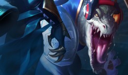
| Conclusion: | The crocodile body showing grey scales, lateral osteoderms on the tail and large thick scales on the head is hardly original but certainly appealing. The clothes leave such discretion behind and incorporate multiple bright colours that easily catch the eye. The tail opening is interesting while the mesh on the sides of the jacket and sleeves are something different and nice but that’s as far as it goes. The general feel is just of colourful, modern clothing with a clearly flashy design. So much so that the lone spaulder on Renekton’s right arm seems reasonable. The trouser and snickers are nothing noteworthy and the jacket’s huge logo seems exaggerated. The gloves also look rather extravagant but if we are to consider the monocle and headphones we could say that they fit right in with each other. The lavish extravagance is further displayed by the logo-shaped blade which simply strikes as preposterous. However, the new particle colours for the abilities are so subtle that can be easily ignored due to their limited relevance. The recall does make itself notable: fitting Renekton’s rage well, but there’s only so much it can do. Adding it all together, there’re a few elements to rescue from the design but in general it’s overdone. The modern take is tinted with too obvious team references that make the skin subpar as a different look. If you look for a team skin, though, it certainly suffices. |
Conclusion
Overall, there are no bad skins but the general idea is to dress the champions with some casual clothing and gaming gear and call it a day. There’re many instances where it could’ve been possible to play with the aesthetic to give a unique feel to the skins. The commemoration aspect could be kept while also allowing for the skin to have a distinct style that is more than a change of clothes. That is mostly overlooked and yet SKT T1 Kalista manages to do just that within the confines of such a limited approach.
While SKT T1 Kalista incorporates a good amount of yellow particles with some blue touches it manages to deliver a complete different feel that isn’t merely colour centred. The sporty clothes and human features show her alive and full of energy displaying an aspect that hasn’t been explored before. Thanks to that, SKT T1 Kalista is a skin worth considering for fans of the Spear of Vengeance as it shows a different and appealing aspect of her.
SKT T1 Alistar has a space age feel that is interesting but the design restrictions necessary by the adherence to the team’s colours make it more extravagant that it should be. It’s a skin with a distinct style but it exaggerates in its elements which can make it feel more advertisement than fashion choice.
SKT T1 Ryze, overall, passes for a gamer with a flashy fashion sense. The adaptation works but also makes concessions to follow the classic style which make him carry a cumbersome trophy for little reason. Finer options could’ve been found and the style could’ve been less exaggerated and the particles more vivid. Still, for what it aims at it manages to get close enough.
With a faint contemporary feel, SKT T1 Azir is a skin that can’t escape its team endorsement nature. The look never breaks the dichotomy between the modern, casual style and the fantastic angle so the lack of focus is felt. Nonetheless, the colourful visuals are attractive and make the skin stand out. If taken strictly for what it is, it’s a good option.
SKT T1 Elise is actually quite nice if we are to ignore the forced incorporation of logos and references to them. The human sport clothing and the robot spider design suits Elise well and both are appealing appearances. However, the imposed logos dilute the lean design and unnecessarily burden it. The result is an uneven skin that has its appeal but with flaws that have to be excused.
SKT T1 Renekton is a flamboyant skin with too pronounced a tribute to the corresponding team. The modern take isn’t bad but the extravagance detracts from the few interesting design choices made. Those looking for a contemporary style will find the skin overdone but the team ad side works.

